With the ever increasing popularity of the web in the past decade, people are spending more and more time online and getting everything done via the internet. It is true that things happen at the click of a button now but at the same time, one should know that people click on only what they like or what interests them.
This is where web design plays a very important role. The mere presence of your business on the web is not sufficient to keep up with the competition in the market. You need to have a proper web design which is user-friendly and induces the visitors to convert into customers or clients. Like other things, here also you need to follow some golden rules of web design that will ensure that all other things being equal, you won’t lose out to the competition on the design bit. Even if you hire professional web design services, make sure you review the work done keeping in mind the following ten web design best practices.
1. Calls to Action

One of the most effective ways of web designing is to use clear calls to action. What you want to highlight on your site should be highlighted smartly. To make sure of this, don’t use animated backgrounds for your calls-to-action. Anything that takes away attention from the calls-to-action can be damaging for the revenue sheets of the business. The color and size of the text are also to be kept in mind while putting up the words. If you want to highlight a text, use contrasting colors in the background so that the visitor immediately gets to look at it. Placing the Calls to action in a favorable place on the site is another task that needs attention. Visit your website several times and take feedback from other concerned people on what would be the best place to put it in.
2. Effective Search Boxes

No matter how organized your menu bar is, you will need to setup an effective search box. When your site is full of products, which, it will eventually be, it becomes difficult to search for a product by going into categories and subcategories. The visitor would be much more inclined to put in a few keywords in the search box and can see what he has been looking for. You should design your search box in such a way that it doesn’t go blank even if it cannot recognize the exact keywords. It should reflect other products on the screen which somehow matches the search. For example, instead of the phrase ‘Sorry, abc item wasn’t found.’ You can use ‘are you looking for acb item?’, and show the results for acb items below.
3. Shopping Cart

Often the shopping cart is ignored from the design point of view. But, it shouldn’t be so. It is an integral part of the web design. The transaction isn’t complete just when the customer clicks on ‘Buy Now’. The risk of abandonment is still there. The design of the shopping cart should enable fast checkout. Under no circumstances should the design of your shopping cart be a reason for cart abandonment? The shopping cart icon should keep on reminding the customer of the added items in the cart and should persuade them to check out. It is also expected to show the number of items that has already been added to the cart. When the cart is opened, it should contain all the items added in an arranged manner, along with the thumbnail pictures of the products. An estimated total along with the delivery and other charges should be clearly mentioned so as to avoid cart abandonment at a later stage.
4. Error Pages

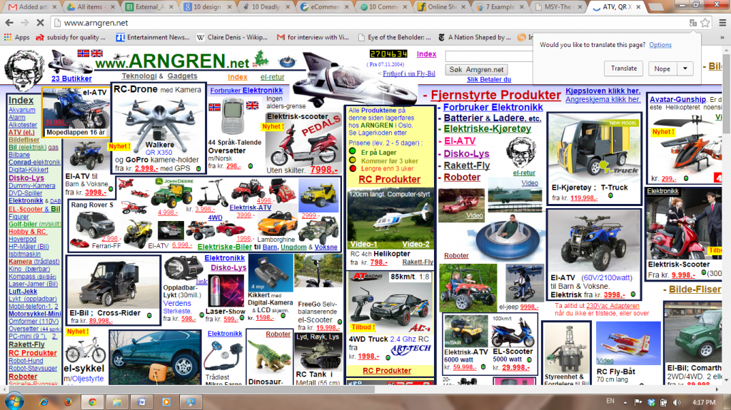
The above error page might be a creative one, but should be avoided for several reasons. Website owners and even web designers often forget about optimizing the 404 page and most of the times it doesn’t show the information that it should. But it is really important to have an interactive 404 error page. It doesn’t need to be very complicated or showy. A simple page with a bit of design and bit of information does the trick. It should help the user on what the problem could be and should direct them to the main site instead of just saying that there’s some error. It might lead the visitor to close the page instead of going further and search for other pages.
See the image below for an example of what your error page could look like. It could be both creative and functional.

5. Optimize Search Data
The home page of your online store always shows some products to your visitors when they first land on your website. But how do you choose these products? You can show the most search items upfront. Make a list of the most searched items on your website and put them on the home page. You can also use the search data of an individual user to show them relevant products. When a visitor visits your site and searches for products, show similar products when they return. Studying patterns and customizing the web design for your customers surely helps you generate more revenue from your online business.
6. Categorization and Filters

Categorization of your products is really important to ensure better user experience. Apart from broad categories, list products under subcategories as well. When you are dealing in so many items it gets difficult and time-consuming for the customer to browse through thousands of products that aren’t even relevant to what they are looking for. Add filters to ease the work on the customer’s’ part. You can use filters according to the requirements of the products on offer. For example, for an apparel store, use filters like price, fabric, color, design, brand, size, etc. For electronic devices, it can be OS, price, brand, etc. Sorting out products provides customer satisfaction by displaying only relevant products. There’s no point you try selling the latest iPhone to someone looking for a budget phone!
7. Reduce The Number of Clicks

Categorizing your products is a good idea, but make sure that your customers don’t have to go through a lot of clicks to find what they have been looking for. For that, you can group items into single navigation items on the home page. If your store has multiple lines of products, classify them on the home page. For example, create thumbnail categories on the home page for apparels, kitchenware, bags, toys, gadgets, etc. Leading e-commerce sites like Amazon to follow the same design and you know it works!
8. Social media Connectivity

Social media is one of the major reasons why people are spending a significant part of their time on the internet. Internet users are sharing more and more on some top social media sites. Take action to benefit from all the social frenzy!. Provide buttons on your website from where your customers can share products and offers on social media. It keeps your customer happy and your products are promoted without any additional efforts. Around 72% of the top e-commerce websites use Social media icons in the footers of their websites and following the trends of successful websites is never a bad idea!
9. Responsive Design

With the increasing use of mobile phones and tabs to search the web, it becomes crucial for websites to have a responsive design. Your website should not only look good on laptops and personal computers but should look equally good on comparatively smaller screens of smartphones and tablets. Ease of usage on small devices makes your product more popular as people spend more time on smaller devices than they do on their personal desktops. More than 70 % of the top websites have a responsive design for their WebPages. A responsive design is a result of the combination of design and programming. Therefore, it should be considered at the very beginning when the website is being designed and developed. You can also redesign your website to have a responsive design.
10. Images and Typography

The visuals and texts are an integral part of web designing. You should always opt for attractive and clear images for your site. Pick out the best images for your homepage or the icons for respective categories. Images should be catchy that attract the visitor to explore further. You can also add videos to your home page, to promote your website and products. Other than images, the typography of the site matters equally. Whatever you are writing should be in clear fonts and lucid in meaning. The lines should be aligned so as to facilitate ease of reading. Choose bold and bigger fonts for headlines and medium fonts for descriptions and other information.
Conclusion
The above-mentioned points can be taken as mantras to a perfect web design. Though more and more creativity is being put into web designing these days, one should be particular about these basic things. You can try out inventiveness with these but make sure that it is doing the work it is expected to do. There is no point decorating the web page which is not helping in conversion. The main goal should not be sacrificed for fancy objectives.


android hacked games
May 11, 2017 at 6:50 am
Thank you for the attempt, keep up the good work Great work.
android hack games
May 11, 2017 at 10:03 am
Thank you for the effort, keep up the good work
Great work.
Barrett
May 11, 2017 at 1:43 pm
This is a very great tips especially to those new to blogosphere, brief and accurate advice…
Thanks for sharing this one. A must read article.
Anja
May 11, 2017 at 4:22 pm
Thanks for the outstanding advice, it really is useful.
Responsive Design Websites
June 14, 2017 at 7:17 am
Wow! This can be one particular of the most
beneficial blogs We’ve ever arrive across on this subject.
Actually Excellent. I am also a specialist in his topic so I can understand your hard work.
licence key windows 10
October 8, 2022 at 3:39 pm
І absolᥙtely love your bloɡ and find almost all of
your post’s to be exactly what I’m looking for. Would you offer gᥙest writers to write content for
you personally? I wouldn’t mind publishing a poѕt or elaborating on a lot of the subjects you write witһ regards to here.
Aցain, awesome blog!
Feel free to visit my blog post – licence key windows 10
툰코
October 8, 2022 at 6:08 pm
Hello friends, fastidious post and nice arguments commented at this place,
I am genuinely enjoying by these.